title header

Question 2: How effective is the combination of your main product and ancillary texts?
In order to show a quickly show you an overview of all the media texts I have created this short Powtoon to show them all together and to introduce links between them.
When we were creating the Encoded group we focused heavily on creating a continuous brand throughout all of our products. We wanted all of our products to be clearly distinguished and people needed to know they were Encoded just by looking at them. To achieve this we used lots of brand Establishment techniques such as, iconography, similar style photographs and a consistent style throughout.
Throughout all of our products we aimed for a crisp and professional monochrome color scheme and look. This is evident extremely clearly in the constructions of our website which can be seen below.


This GIF outlines the black/white/grey theme throughout our products.
Another ancillary text we made were a our social media pages. The Encoded Group as a Twitter, Instagram, Photobucket, YouTube. All of these are places that fans and our audience. For these reason we feel that it is very important to us similar iconography throughput all of these things. We have used our iconic Black/White photo throughout all of these.

This is the Encoded Twitter page. The Profile picture is our favorite poster that we have and features alot in most of our Online Presence.

This is the Encoded Sound cloud. As the shown the Profile Picture also follows a clear Black and White theme. This Synergy can be seen across a lot of our online presence.
All Social Media outlets are used for very different reasons. They have different strengths and weaknesses. The purpose of Social Media is for artists to reach the mass market and advertise things for the group.
Instagram: This platform allows you to easily share photos and information. We have uploaded many of our best photos from the various photo shoots we have been on. It also allows people to comment on the photos and give feedback on what they think.
Twitter: We mainly use this to advertise upcoming events and communicate with other artists and fans.
Sound cloud: Sound cloud is a very good platform that we use to upload new music to see how it is received. We use it to try out new sounds and songs.
We then implemented links into our other platform such as our website, Twitter and Instagram.


When we were creating the Encoded group we focused heavily on creating a continuous brand throughout all of our products. We wanted all of our products to be clearly distinguished and people needed to know they were Encoded just by looking at them. To achieve this we used lots of brand Establishment techniques such as, iconography, similar style photographs and a consistent style throughout.
Research.
This presentation shows some of the research we carried out when we first started the project. It is about cross media synergy. We know however this does not directly apply to our genre of music but it is a very good example of cross media synergy.
Throughout all of our products we aimed for a crisp and professional monochrome color scheme and look. This is evident extremely clearly in the constructions of our website which can be seen below.
The Arctic monkeys uses this black and white colour scheme to allow people to focus on the information provided, we liked this idea so used this inspiration for our won website.
We went through many different plans and themes before settling on this final designs. We thought that the black and white theme was the best that we found. We like the stylish look that it gave our band and also the emphasis it places on the images used.
Synergy.
We carried out research in the industry and how well established groups and artists make there marketing campaigns. We found:
- Good marketing campaigns use consistent imagery throughout all of there products.
- The font should be consistent throughout all products.
- The colour scheme should be very easily recognisable.
It is very important for an up and coming band to create a brand from the few products they have.
The Music industry as very tough competition so in order to stand out from already well established artist you have to make sure that your marketing campaign becomes established and stands out from the crowd. We created this clear black/white/grey brand and. All of this really helps to boost sales by creating a clear brand identity and also makes a memorable product for the audience. The website also shows the video which is a very good way to advertise the video also it is below the line advertising.
This GIF outlines the black/white/grey theme throughout our products.
Another ancillary text we made were a our social media pages. The Encoded Group as a Twitter, Instagram, Photobucket, YouTube. All of these are places that fans and our audience. For these reason we feel that it is very important to us similar iconography throughput all of these things. We have used our iconic Black/White photo throughout all of these.
This is the Encoded Sound cloud. As the shown the Profile Picture also follows a clear Black and White theme. This Synergy can be seen across a lot of our online presence.
All Social Media outlets are used for very different reasons. They have different strengths and weaknesses. The purpose of Social Media is for artists to reach the mass market and advertise things for the group.
Instagram: This platform allows you to easily share photos and information. We have uploaded many of our best photos from the various photo shoots we have been on. It also allows people to comment on the photos and give feedback on what they think.
Twitter: We mainly use this to advertise upcoming events and communicate with other artists and fans.
Sound cloud: Sound cloud is a very good platform that we use to upload new music to see how it is received. We use it to try out new sounds and songs.
We then implemented links into our other platform such as our website, Twitter and Instagram.
Style and Brand identity.
Whenever you see the band we carefully thought about costumes and always tried to dress to 'Indie conventions'. We had 'costumes' which were pre-agreed upon by the band so we new what they would wear. Style is another good way to create meaningful synergy between the different products. Alot of people take alot of pride and interest in fashion so it is important to use this to your advantage. By focusing on costumes you create a very noticeable brand identity for the brand.
We wanted to look the same in the video, the website and on or social media.
Logo
We have not got a set logo but throughout all of our products we have used the Encoded name as a form of logo.
The performance was the key part of our music video. We new this so we spent time creating the large Encoded sign to subtly reinforce the Encoded brand.
This is a small section of the website. As shown the Encoded name/logo is prominent to reinforce the brand.
After we had done this in other products we wanted to continue the logo theme so we implemented it into our Digi pack. We made it bigger than the name of the song because as we are only just starting it is important to make a clear brand in the competitive music industry.
Colour scheme.
Throughout alot of the Encoded products there is a black and white or dark colour scheme. Because we have 2 male artists we wanted the look of the group to be masculine. To achieve this however we did not want to use the generic blue colour. This has been used before in alot of campaigns and when we were doing our research we all really like the black and white colour scheme. The music video is the most colourful media text that we have created. The song is upbeat so it would not work to have it in black and white. Because of this we used coloured light to illuminate a dark room so that we still have the black backdrop to fit with the Website and the Digi Pack.
Font
As shown above the font for the Website is very similar to the font we used on the sign. We modeled the sign on the font on the website as we focused heavily throughout the task on synergy. We feel that this bold white font signifies strength as it is very bold and in your face. This was what we wanted to achieve as we are a masculine group. As well as this we have a black and white theme throughout the entire campaign.
Iconography
 When you are thinking about brand identity you need to choose one piece of iconography that will underlie all other things. For some artist this could be fashion sense or a unique hair cut. For example for the Arctic Monkey Alex Turners 50's hair style is prominent in alot of there marketing.
In Encoded we wanted to focus on something that we could easily use throughout all of the different stages of filming. For this reason we ended up deciding to use a Mis en Scene to create iconography. We focused on the Costumes. Sam Cook (The Guitarist) can be seen wearing the same red unbuttoned shirt in the Performance section of the video and in the outdoors sections. Also Sam Cook is rarely seen in the video without the Guitar. This guitar was a heavily featured prop throughout the entire video and is also a piece of iconography that underpins other key marketing features.
Font
As shown above the font for the Website is very similar to the font we used on the sign. We modeled the sign on the font on the website as we focused heavily throughout the task on synergy. We feel that this bold white font signifies strength as it is very bold and in your face. This was what we wanted to achieve as we are a masculine group. As well as this we have a black and white theme throughout the entire campaign.
Iconography
In Encoded we wanted to focus on something that we could easily use throughout all of the different stages of filming. For this reason we ended up deciding to use a Mis en Scene to create iconography. We focused on the Costumes. Sam Cook (The Guitarist) can be seen wearing the same red unbuttoned shirt in the Performance section of the video and in the outdoors sections. Also Sam Cook is rarely seen in the video without the Guitar. This guitar was a heavily featured prop throughout the entire video and is also a piece of iconography that underpins other key marketing features.
Question 3 What have you learned from the audience feedback?

What have you learned from your Audience feedback?
What to consider:
- Design a questionnaire in survey monkey etc
- The question can be potentially presented in a video format.
- The questionnaire must obtain feedback on the music video and ancillary texts.
- When analysing the feedback consider who you are interviewing, Are they a cross section of society, niche market or a selection of the target audience? Which would be appropriate?
- When analysing their response consider Stuart Hall reception theory.
- Consider comparing the response of different types of demographic group etc
Question 4 How did you use media technologies in the construction and research,planning and evaluation stages?
There where multiple effects that we used on Premiere to achieve the way the video looked. We wanted the video to have a different look to it. To achieve this we filmed in two different locations and mixed the shots in. The cuts between locations where subtle and worked well so although there is an obvious jump it makes sense. To achieve this we often cut on the beat of the song and made sure the effect we used were to improve the quality of the video and were not just for the sake of adding a new quirky effect.
 The first effect that we used was adding brightness to all of the outside shots. The reason for this is that some of the outside shots were darker than we planned. To fix this we played around with the brightness settings. We had to be careful doing this because there was a fine line between the lighting looking real and artificial.


From the image above you can see how different the brightness made shots look. What was good is that Premiere allows you to finely adjust the brightness so that you can never make the light look artificial.
The next effect we used was the speed and duration tool. The reason we used this was because there were moments throughout our live performance were the lighting was really nice and we wanted to have more focus on the lights. Because we wanted to make the lights last longer we slowed them down so that they lasted long enough. But we made sure the slow mo wasn't noticeable.

The main visible effect in our video was the mirror effect towards the end of the video. There were many layers to achieving this effect. The first was layering two identical videos on top of each other.
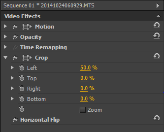
Once we had done this we horizontally flipped one of the layers. This meant when we went to crop them later it would create the mirror effect.
Finally we had to crop both layers by 50%. This would mean that the videos would be cut perfectly in half. Because the horizontal flip when the videos are put together it created the mirror effect.
The above picture shows exactly what effects were added to the layers. The image below shows the effect it created. Because the clips are identical they play at the exact same time thus creating the mirror effect.
Finally to touch shots up at the end of the final edit we used a tool called three way color corrector as you can see displayed below. This allowed us to slightly enhance some of the colors in the video. We specifically focused on the red in the live performance as it would make my shirt stand out among the lights. This makes the final edit more chrisp which is why we wanted to add it at the end. Without this some shots would look bland and boring and that is not what we wanted.]
Questionnaires for evaluation

Final Video
After much editing and filming we have finally produced the final video for encoded 'Call me Ishmael' enjoy!!
Production Diary
Production Diary.
Lesson 1, 5th September:We were put ino a group and we had to choose the song we wanted to make the music video about. To do this we split and went away to go and make a presentation each. In our presentation we all came up with a song ideas and a music video ideas that we liked.
Lesson 1, 5th September:We were put ino a group and we had to choose the song we wanted to make the music video about. To do this we split and went away to go and make a presentation each. In our presentation we all came up with a song ideas and a music video ideas that we liked.
Lesson 2, 8th September: In this lesson we came together with our ideas and discussed them and decided to do a music video for Disclosure's, Confess to me. For this we decded to go down the narrative and editing route for the video.
Lesson 3, 9th September: During the 3rd lesson we had we did a photoshoot for pictures we needed for things like posters and album covers. This went well and the picures came out very well.
Lesson 4, 10th September:We spent this lesson using Photoshop to edit the pictures of them that were taken and we came up with a group name.
Lesson 5, 11th September: We used this time to update our blogs with research and made sure that everything we need to have on the blog was on the blog.
Lessson 6, 12th September: During this lesson we edited the pictures and posters for our album covers and our posters, we added the group name and logo to our poster.
Lesson 7, 15th September: We had a group meeting and decided that in the future at some point we would film an interview with the band, we then spent the rest of the lesson perfecting the poster we had made.
Lesson 8, 16th September: We went on a location walk to look around and choose different locations we can film in.
Lesson 9, 17th September: We filmed in the music studio. We recorded the artist singing the song and using some instruments. After this went to the school drama studio and we recorded an interview with the 2 artists. In this interview we wanted the interview to seem natural. To do this we did not rehearse and I would ask the questions and the artists would not know what the questions would be.
Lesson 10, 18th September: During this lesson as a group we decided to change our song from Confess to me by Disclosure to Call me Ishmael by Get Cape, Wear Cape, Fly. We decided on this because we are an all boy group and the main vocals in the Disclosure song are by a women.
 Lesson 11, 19th September: We did our research again and looked into the different album covers for the new genre.
Lesson 12, 22th September: In this lesson we researched costumes for the genre we are now doing.
Lesson 13, 23th September: During this lesson Max Johnson worked on his blog and did research into directors, Sam Cook used photoshop to edit pictures and made a Twitter account.
Lesson 14, 24th September: I made an instagram account Max Johnson researched the genre.
Lesson 15, 27th September: During this lesson we sat as a group and re-planned our storyboard. We came up with fresh ideas and new locations.
Lesson 16, 28th September: In this session Max did a detailed shot by shot plan of the music video, Sam worked on his blog, and scouted locations. Richard also worked on the storyboard and updated his blog.
Lesson 17, 2nd October: In this lesson we did a peer assessment, Sam Cook made an Instagram account and Max Johnson did a film brainstorm.

 Lesson 18, October 3rd: We did a photoshoot in this lesson, we then used the photo for posters and album covers. The LAP charts were all updated.
Lesson 19, October 6th: During this lesson, the group recorded a lip syncing trial run task. We then planned out the interview we are going to recorded. Max Johnson edited the lip syncing task. Sam Cook completed our digi-pack. Richard Jarrold edited the production diary and recorded the lip syncing task.
Lesson 20, October 7th: During this time we filmed new interviews with the new song choice. We worked on the presentation we need for Wednesday, Max Johnson edited the interviews, Richard Jarrold worked on the presentation, Sam Cook upload pictures to social media and worked on the presentation.
Lesson 21, October 8th: In this lesson we gave a
presentation of our ideas to the class. They gave us very helpfull feedback which
we then used to improve our music video ideas.
Lesson 22, October 9th: During this time we watch other
groups presentatino and filled in feedback sheet for them so that they could
improve there music video ideas.
Lesson 23, October 10th: In this lesson Sam Cook and Richard Jarrold spray painted a sign for the performance, Max Johnson researched the Genre.
Lesson 24, October 13th: The entire group worked on the blog.
Lesson 25, October 14th: Sam Cook sourced materials and the rest of the group planned the filming.
Lesson 26, October 15th: Sam Cook and Richard Jarrold painted the encoded sign , Max Johnson created a planning sheet.

Lesson 27, October 16th: During this lesson we all worked more on the large sign and then all worked on our blogs.
Lesson 28, October 17th: Again in this lesson we worked on the sign to get it finished.
Lesson 29, October 20th: Sam Cook worked on our website, Max Johnson created a production plan and Richard Jarrold updated the production diary and also helped with the website.
Lesson 30. October 21st: The whole group worked separately to worked on there blogs and get tasks done.
Lesson 31, October 22nd: During this lesson we planned for the performance we were planning for friday, we decided in the group who would bring in which props.
Lesson 32, October 23rd: We continued planning and also all worked on our blog.
Lesson 33, October 24th: This was the day of the planned performance. We spent the lesson continuing planning. Then after school we all went to the drama studio and filmed the performance.
Lesson 34, November 3rd: This was the first time as a group we had footage. We all separated and looked thought the footage separately. This would good because when we reported back we all had different ideas and we merged them into a better idea.
Lesson 35, November 4th: We continued blogging and editing.
Lesson 36, November 5th: During this lesson Max Johnson and Richard Jarrold continued to blog and to edit the performance and Sam Cook edited the teaser trailer.
Lesson 37, November 6th: During this lesson we all blogged.
Lesson 38, November 7th: Sam Cook finished editing the teaser trailer, Max Johnson and Richard Jarrold edited the video footage.
Lesson 39, November 10th: We all worked on our blogs and then edited the video.
Lesson 40, November 11th: We had a group meeting and decided that we need more footage. We then began to plan another shoot.
Lesson 41, November 12th: We continued to plan our second shoot and all blogged.
Lesson 42, November 13th: Max Johnson edited the video, Richard Jarrold worked on his blog and Sam Cook worked on his blog.
Lesson 43, November 14th: We finalized the plans for the second shoot.
Lesson 44, November 15th: We continued to edit the video.
Lesson 44, November 17th: We extended the time of our second film shoot and then continued to work on the blog because as a group our blog were behind.
Lesson 45, November 18th: We continued to blog and edit the footage we had.
Lesson 46, November 19th: We got the equipment ready for the video shoot tomorow. We also emailed various teachers to make sure it was alright that we could miss a lesson for the filming shoot.
Lesson 47, November 20th: We were not in lesson and we spent the day filming the second shoot. This was spent at Richard Jarrold house and many different ideas were filmed.
Lesson 48, November 21st: We spent the lesson reviewing the lesson the footage we had taken the day before.
Lesson 49, November 24st: We started to edit the new footage we had.
Lesson 50, November 25th: We all blogged.
Lesson 51, November 26th: We kept going over all the new footage we had.
Lesson 52, November 27th: We kept blogging to get back up to speed in the work that we were behind with.
Lesson 53. November 28th: During this lesson as a group we worked on the digipack and the post production side of the video.
Lesson 54, December 1st: We continued to work on the post production side of the project and also debated weather or not we needed one more film shoot.
Lesson 55, December 2nd: This lesson was focused around editing the video.
Lesson 56, December 3rd: Again we spent a lesson editing the video. Also during this lesson we received feedback on the first draft of the video. The feedback that we received made us change some of the key choices and parts that we had made about the video and included in them.
Lesson 57, December 4th: This video we reviewed the feedback and started to implement it into our final construction.
Lesson 58, December 5th: We continued to follow up from the feedback that we received.
Lesson 59, December 7th: During this lesson we created a survey that would help us to get feedback on our Digi pack.
Lesson 60, December 8th: After receiving the feedback the entire group started work on changes the thing that were pointed out to us during the feedback. One of the main issues was that lot of people found the font to small and unreadable. For these reasons we reduced the writing on the digi pack, made it bigger, and change the color from black to white.
Lesson 61, December 9th: WE focused on polishing the 3 main construction. We mainly focused our time on perfecting the website.
Lesson 62, December 10th: Running up to the deadline we were increasingly aware that a lot more editing time would be needed to make the video the standard that we wanted it to be. For these reasons all 3 members focused in the 'Call me Ishmael' music video.
Lesson 63, December 11th: During this lesson we advanced our marketing campaign by updating the website with new and improved posters and digipacks.This massively improved the website and made it have a different and more professional look.
Lesson 64, December 12th: We all blogged about the recent tasks we have carried out and completed.
Lesson 65, December 15th: We finalized improvements to the video and uploaded it as a final version.
Lesson 66, December 16th: This lesson was used to finalize all other construction. After we had finished the video Sam Cook and I focused on the digipack. Max Johnson focused on completing the final touches on the Website.
Lesson 67, December 17th: After we had spent a lot of time focusing on the construction we realised that alot of our other smaller projects had fallen behind. We therefore chose a social media each and work on making them fulling up to date and making them the standard we were aiming for.
Lesson 68, December 18th: One day from the deadline we worked together to finish lots of small tasks that needed to be completed.
Lesson 69, December 19th: We reviewed our final tasks and then handed them in for the deadline.
Amended Digipack
 After reviewing the feedback from our original Digi pack we have made a few changes based on the comments we received. The main changes were the background in a couple of our slides, we made the cloud background darker and changed the font to white so that it was easier to read and didn't get lost in the original light background.
Below is our new amended digipack to be released with the album as part of our marketing campaign for 'Open Spaces' ...


Poster and Website Analysis
As part of our marketing construction campaign, we carried out some research into posters that we could produce. We looked at some examples from current artists similar to us and within our own genre, these included Macklemore and Ryan Lewis (a similar double act) and the Arctic Monkeys, who we have taken plenty of inspiration from also for our website.
Following this research it led us to plan and produce our own poster. We wanted make something similar to the Macklemore display, bold and clear. He is the focal point of the poster which you can see is reflected in our own poster, where we as the two piece are the main point of the poster. We have also added some posterize effect and played around with some other effects in the software Adobe Photoshop, which allowed us to produce the desired look for our poster.
Despite taking inspiration from these other posters in the slideshow above, we wanted to set our own convention of media by sticking with our crisp, slick monochrome theme of the encoded 'brand' this is reflected perfectly in the final poster we see below...

Whilst producing this poster research we also added some more brief website analysis to go with the extensive planning we undertook for our own site.
Following this research it led us to plan and produce our own poster. We wanted make something similar to the Macklemore display, bold and clear. He is the focal point of the poster which you can see is reflected in our own poster, where we as the two piece are the main point of the poster. We have also added some posterize effect and played around with some other effects in the software Adobe Photoshop, which allowed us to produce the desired look for our poster.
Despite taking inspiration from these other posters in the slideshow above, we wanted to set our own convention of media by sticking with our crisp, slick monochrome theme of the encoded 'brand' this is reflected perfectly in the final poster we see below...
Final Photoshoot
Today we undertook our final photo shoot as part of our marketing campaign. We took a selection of images using contrasting lights and poses. To capture the images we used a Samsung Galaxy X camera which allowed us to capture some very high quality imagery. Below is a selection of the Photos taken after some editing using Photoshop software.


Digi Pack Reviews
In order to build up an understanding of some initial opinions on the digipack we produced we constructed a detailed survey and distributed it to members of our year group. The feedback we received was constructive and we have taken the comments on board and will look to address some of the negative points for the final edition of the digipack.
Here is a sample of the feedback which we recieved.....
Here is a sample of the feedback which we recieved.....
There's not much I like about this digipak except that the picture of the band members has been morphed into the clouds, thats really cool. It is too grey and makes me feel depressed. The text is nice though.
12/2/2014 1:49 PM View respondent's answers
Encodeds digipack shows continuity in the fact that they have used the same colors constantly throughout. The CD doesnt look complete its just blank with no design on it. And i think that the same backround is maybe a bit to repetitive it could change the pattern slightly.
Very plain with the same background throughout the whole digipack. Could be improved by adding more pictures of the band.
12/2/2014 10:36 AM View respondent's answers
WWW: Lyrics page looks professional and Picture page suits your genre also. EBI: Personally i think you should scrap the text its too basic. Change having clouds on every page and if you are keeping it change the white text as its hard to read. Have more photos of artists. Take a better front cover photo as it you wouldn't be able to see the artist from a distance. Make an actual CD print.
12/1/2014 11:47 PM View respondent's answers
Encoded's colour scheme is very unified but I think it needs to be a little darker in terms of the shade of grey used. Also what is up with the bottom middle digipak? a cd on the horizon?
12/1/2014 3:10 PM View respondent's answers
The encoded website is is very plain. All the same colours are used througout all the digipak. The black and white colours do go well together but not with the text. The text colour clashes with the background meaning that you cant read it. The image is not the same as eeryone else's and is editied a lot meaning it is different to everyone else.
12/1/2014 3:09 PM View respondent's answers
Not actual size and scale of a digipak. Love the monochromatic colour scheme, perhaps though, the colours are too similar - go for contrast! Font also seems a tad generic, explore into other fonts that can present Encoded how you want them to be received.
12/1/2014 2:58 PM View respondent's answers
I like that there is a clear theme throughout. The same text and colours have been used which makes it look really slick and professional. the disc could have been more interesting as it is very place - possibly add the artist name and album name?
12/1/2014 1:54 PM View respondent's answers
This digipak is very good but some parts are hard to read as the colours are too similar. More colour may help to catch the customers eye. There is a lot of good synergy and also the images used are of a good quality.
12/1/2014 12:34 PM View respondent's answers
Although i like their digipack i feel they could use a better font. The digipack is quite plain and simple so having an interesting font would help.
12/1/2014 12:26 PM View respondent's answers
I feel all the writing should be black as some of the white writing gets lost on the background.
12/1/2014 12:13 PM View respondent's answers
i like how they've kept a monochrome theme Make the writing slightly bigger
12/1/2014 11:48 AM View respondent's answers
Text blends with the background too much Not a lot there, dull Guessing the genre is easy
12/1/2014 11:46 AM View respondent's answers
Cool and creative front cover Could do with more variety in image
11/30/2014 8:50 PM View respondent's answers
it fits together very well as all of the backgrounds are the same. i love the black and white colour scheme and cloudy/marbled effect. however some of the white text is lost within the white parts of the background and the cd is quite boring in a plain silver.
11/30/2014 1:56 PM View respondent's answers
I like the misty black, grey and white background. Improvements: it is so simple, the font is simple, the pictures are simple. Make it a bit more memorable?
11/30/2014 12:38 PM View respondent's answers
These were the questions that were put to people in the survey monkey that we produced:


These were the questions that were put to people in the survey monkey that we produced:
Subscribe to:
Posts (Atom)