As part of our constructions I produced a trailer for a UK tour that we are planning on taking on in the future. We believed that by producing a trailer and releasing it on various forms of social network and our website would help to try and create some hype online about the band. I have inserted the video below...
title header


Filming and editing evidence
Shots So Far
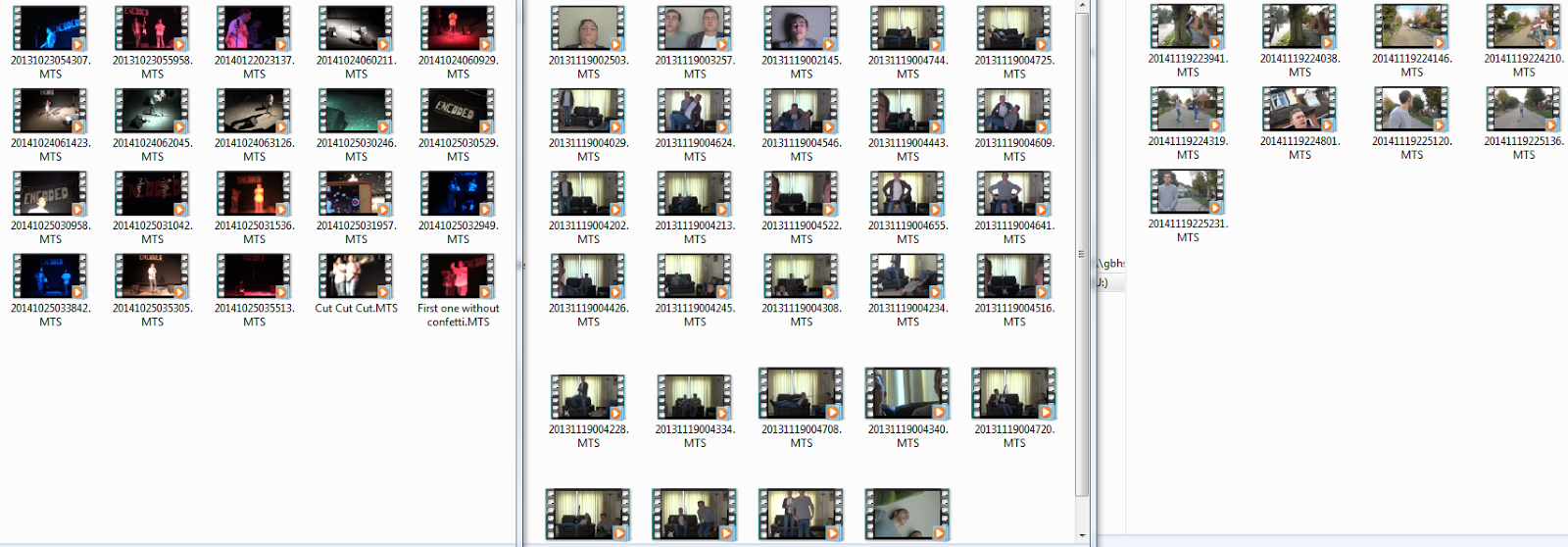
These are all the shots we have to far. The shots on the left are all the live performance shots as these will take up the majority of the video. All the shots of the live performance are at least 3 minutes long meaning there will be enough footage.
The middle column are the shots that we recorded in the house, here we recorded lots of shots for a montage shot we intend to put in the video. This part of the video will involve us moving around the front room. We intend to make this shot look like the band is relaxing outside the show.
The last column are shots we recorded in the road messing around. These shots will be used throughout the video to show the band messing around. This will give the viewer a more personal look into the bands life.
Editing So Far

This is how are editing is going at the moment. We feel that the first 50 seconds of the video is sorted and looks good as we have lots of cuts and variety of shots with perfect lip syncing. The problem we have is that we don't feel there is enough shots to fill the whole 4 minutes. Because of this we will be looking to do one more shoot.
Live Performance Risk Assesment

This is the Risk assessment for the filming of the performance which will happen after school on Friday the 24th of October. For Health and Safety purposes we wanted to fill out this risk assesment. Doing this also made us think more about what could possibly go wrong in the performance and helped us to plan around these problems incase they do occur.
Editing Outline Adobe
We are going to be editing our final footage and produce our final music video using the software Adobe Premiere Pro CS6 which is a highly technical program and allows us to really experiment with our ideas and bring our planned videos to life really well.


The picture below shows Max beginning the editing with some of the test footage we shot earlier in the week. As you can see the program CS6 is opened and in full use. Below is a a more detailed example of how the Adobe premiere program looks when in full use.
Merchandise
Below I have displayed some of the items of merchandise we have designed for Encoded. We chose to come up with these sorts of merchandise after investigating how some similar artists and bands like to advertise there act and make themselves more appealing to there desired audience. On this occasion we chose Macklemore and Ryan Lewis to observe (a two piece american hip hop band, who we are big fans of). Despite taking inspirations from some of there merchandise themes we did not want to completely steal there ideas and wanted to challenge the conventions of perceived media products by designing our own. We therefore came up with our own design T shirts, hats bags etc displayed below. These are to be made available on our website as well as on sale at our live shows in order for our fans to be able to access them easily.
Macklemore and Ryan Lewis' Merchandise page


Macklemore and Ryan Lewis' Merchandise page
Encoded Photobucket
As part of the marketing and social media campaign we created a Photobucket account for encoded displaying pictures and shots from all parts of the encoded band, from behind the scenes shots to official photo shoots and filming tasks. Once again it is another way for fans and potential audiences to access the band on a personal and communicative level. We feel that the more social sites we put ourselves on, the more chance we have of acquiring new fans and followers from them stumbling across them on occasions.
Website Planning and Construction
WEBSITE LINK: http://encodedmusic1.wix.com/encoded
In order to help raise the profile of the band and contribute to the accessibility of the group during the marketing campaign we have produced a website accessible to the fans and the public.Whilst reading this please feel free to open up the website via the link above In order to make it available for you to easily follow as well as exploring the many features of the site for yourself.
Each Page of the website has been designed very specifically to tie in with the desired themes of the group as well as to make them as appealing as possible. Below I have highlighted each stage of the planning and design process as well as the constructions that have taken place. We used the website design program 'WIX' to construct our actual website domain and area. This program allowed us to achieve the exact plan that we desired after doing some further research into the program to uncover the various features it had to offer. As you can see further down during the construction stage this was highly beneficial.
Immediately below is the very first designs that we came up with on how exactly we wanted our website to be layed out. Although it lacks any aesthetic color plans we wanted to stick to the them of our crisp,bold, black and white color scheme. Each page has each feature clearly labeled as well as some of the content that each of these shall include.
Home Page
The first homepage design seen here includes various feature to make it appeal to our fans. After studying the Arctic Monkeys website which we took a huge amount of inspiration from for our own, we wanted to make the home page very bold and clear so that a user/ fan can clearly see links to each area of the website, and make it easier for them to locate the link that they desire. One of the most important features that we came up with is the countdown clock, which makes it into the first actual construction of the website. We thought that this interactive moving feature would really bring the home screen to life.

As you can see below not all of the original design made it into the first construction of our website. First of all we kept the top menu bar almost exactly the same as can be seen above. We also included the countdown bar in the same location, However we decided after playing around with different ideas to scrap the side pictures and use one of our best posters as the background for the hole website, this picture as seen below is black and white edited so it sets the tone and the encoded theme for the rest of the website. We also decided to add more information to that of just the band and tried to turn it into more of a news feed similar to that of the arctic monkeys which can also be seen below as a comparison.

Arctic Monkeys News feed style home page...

Band Page
The second page of our website is titled the band page. On this page we wanted to give a little bit of background information about the band and there personal life. We did so as we felt that it would give an insight in to there lives and make a personal connection with fans as we are a new fresh group starting out.
As you can see we originally planned a very basic page with info and in depth background on the personal lives of the band. We also wanted to carry over the same menu bar and countdown clock to make this a constant throughout the website.

However we quickly realized during the construction of the website that this would not be enough to fill up the page, therefore to the right of the bold biography box we have added a live link to our instagram page which displays any of the current pictures that the group are uploading. This is also comes with a URL touch link which allows you to jump straight to the instagram website if so desired.

Gallery Page
Next up we have the gallery page which on paper was always going to be the most simple page on the website as we wanted the images to speak for themselves. We have achieved this by keeping the page extremely simple with just the slide show of images in the middle of the page with the same background and menu bar at the top. This as can be seen below was not on the original first draft draw up however we felt that it would be too bare without this. We therefore added these features to fit the theme of the rest of the website whilst also adding more depth to the page.

Here we can see the gallery webpage as it stands after the first construction. It really conveys the crisp structure of the hole 'Encoded brand' as such. We also plan to add many more pictures and images into the gallery than there is as it stands. This will take place after another photo shoot which we have planned in the near future.

UK Tour Page
The next page on our original plan was that advertising our first UK tour to promote our debut album 'Open Spaces' and the first chosen single 'Call me Ishmael'. At the group meeting we discussed this as being one of our crucial pages and that we wanted to make it stand out. We did this by linking the album in with the countdown clock which is present throughout the website counting down to the release date of the album. When asking people there opinion on the website first construction this was one of there favorite features (see website feedback post).

Only a couple of fundamental changes were made from the original plan to the first construction. Once again we added the standard menu bar at the top of the page to accompany the title and countdown. Also we added the video announcing the Tour which is really now the focal point of the page. It also plays automatically when you navigate onto the page so it draws the viewers attention in straight away which is a real benefit, almost acting as an automated advert system. The video can also be found on the home page further down the news feed style area.

Contact Us page
This was the final page that we planned in the original meeting and draft. It consisted of an area by which members of the public could get in direct contact with the band and make us feel a very like able and approachable act. This is important when starting out as a new music act as it helps to gather support quickly, backing this up with our accessibility on social media we believe it will help to kicks start the group on the right foot with the fans,


After completing these parts of the website we felt that it was necessary to add some more pages to the website in order to make it complete. After researching some other websites as well as our older research pages we decided that we needed to add a page of information on the album and also a shop/ merchandise area on the site.
Album Page
We decided to insert a page specifically on 'Open Spaces'. We felt that it was such a big part of the project that it needed it's own area specifically on the website for fans to access. As I said earlier we also linked it in with the countdown clock which was an extremely popular feature with some of the early feedback we received. After researching further into album pages on various websites we found that it was a popular feature throughout many artists websites. For example, the Kasabian website which can be seen below, has a page dedicated to all of there albums.

Although we took inspiration from including the album page we did not want to base the design of the page around any of these pages as we wanted to make it completely unique and themed with the rest of the website. This was the following design that we eventually made and came up with. As you can see its sits with our theme, including a picture of the album cover as well as some bold information about the album and its release.

Shop Page
The second and final page we decided to add was our shop and merchandise page. We found that this was an ever present theme throughout every website that we visited. We therefore decided that it was essential to incorporate this into our site. Some examples of inspiration can be seen below as the merch section of size records website and the shop section for kings of leon site.


Once again we wanted to source our own design into the page rather than taking any design inspiration from current sites. The other key factor to consider is that we are going to add plenty more merchandise once produced to the section as the current supply is very minimal and we will certainly be improving this as soon as possible.

Audience Questionnaire
In order for the group to build up an understanding of our audience and to gauge an idea of what they wanted to appear in or video we put together a questionnaire and distributed widely to give as as wide a variety of response as possible. Questions ranged from favorite genre of music right the way through to the way people consume and listen to music.
The Questionnaire is available at https://www.surveymonkey.com/create/survey/preview?sm=ZfYdPQnlSV35xoMLL1v2gdYj1lN1UMis0VSRRS83tK1cwBzbW2MreCSOTbMClrdJsALKLqyhpusUqCdTIx4OhA_3D_3D

The Questionnaire is available at https://www.surveymonkey.com/create/survey/preview?sm=ZfYdPQnlSV35xoMLL1v2gdYj1lN1UMis0VSRRS83tK1cwBzbW2MreCSOTbMClrdJsALKLqyhpusUqCdTIx4OhA_3D_3D
Website Progression Home Page

Here I have shown, and will show for the rest of the website, how the construction of the website progressed into the final completed website that we now have.
Above you can see the homepage during the construction process, as you can see the the back ground is plain black at this point in start contrast to the final version. It also lack the final news feed style element which can be seen in our final home page. This was something that was identified by the group during the construction of the website as something that we needed to address and change in order to make the website look more professional and acceptable to the target audience and modern music environment.
Website Progressions Contact us Page

Once again as you can see above, the contact us page was relatively incomplete at this stage of the construction process. At this point we were quite unsure with what to do with the contact page and how best to make it work and look appealing to a fan wishing to communicate with the band easily. In order to make it more appealing, later on we added bigger bolder text as well as personal images of the band to make it look as if you were really closely connected with the artists, at the end of the process it was one of the pages we were most proud of and you can clearly see how it has progressed as the process went on.
Website Progression Tour Page
We didn't actually have an original construction for the tour page, this once something that came as a very spontaneous page that came much later on in the process towards the end of the website plan. It was quite easy to do as we used the standard template that had come previously from the other pages of the website.
Website Progression Gallery Page

When we originally began constructing the website, the gallery page was probably the most plain and basic page. Here we only have a basic gallery with a few images present, however as construction went on and more photo shoots were conducted we carefully added images to the slideshow and built up the gallery page around this.
Website Progression Band Page

Similarly to the home page, in the early constructions of the website we see a lack of the background image which has become a pivotal point throughout our final website, which gives the website its unique encoded identity. Its also missing the social media bar at the side for the instagram page which is present in the final version.
Website Progression

The Album page is pretty similar to the final construction, it is as expected missing the background image, however all that was changed was so shifting around of the the framing and formatting the location of the text. Apart from this the album page was the most complete for the longest period of time.
Costume Plan
We have been planning the costumes for me and Max wear throughout the video. We have decided on going for quite a plain indie look, coming from our influences including the vaccines and the Killers. Below is a collage of the sorts of styles and looks we were going to try and achieve with our costume.

Inspirations for our video
We found this video 'Little Monster' by Royal Blood which really sums up the sort of performance style video we are trying to achieve. However we'd like our video to develop much slower and steadier than the speedy drop on this one.
Weekly Planning Sheet sample
Below is a sample of the weekly planning sheet which our group produces in order to map out the tasks and duties which each member of the group will be taking responsibility for during the commencing week. As you can see the table involves many different tasks from blogging right the way through to painting props for filming.

Record Label Research

As part of our research we looked into record labels and music distribution companies around in today's industry. We firstly looked at the labels of some of the bands that inspired us such as the Arctic Monkeys and The Killers, however we quickly realised that some of these labels were far too big and established for our band starting off to walk straight into. We therefore looked into the band who's song we have sampled, Get Cape Wear Cape Fly, and the labels which they are signed to. Displayed above are the labels that they are signed to, Cooking Vinyl, Big Scary Monsters and rather surprisingly Atlantic Records (who are a large and established company). After looking into the label more we found that they like to invest time and money into new up and coming bands and artist, and bring them into the mainstream view of mass audience. We therefore decided that this would be the best label as it is not only a realistic opportunity as a new artist, it also allows for us as a band to promote on a large scale, and be brought the attention of mass audiences.
Subscribe to:
Comments (Atom)